Our name and domain
Our reporting helps you identify what's working in your knowledge base and where you can improve.
Name
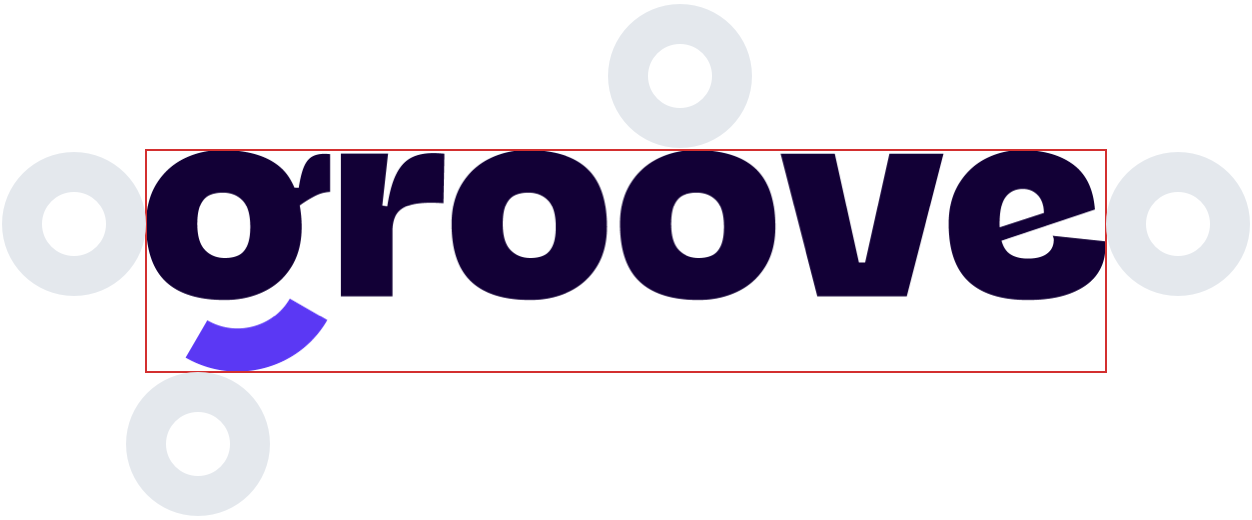
We always capitalize our name when writing it in text, despite the fact our logo is spelled with a lower case “g”
Domain
Although our domain name is groovehq, we always refer to ourselves simply as Groove
Everything you need to know about our logo
- Groove’s logo comes in two different forms, and in multiple color variations for any type of usage.
- While our wordmark is considered our official logo, please feel free to use whichever best suits your needs.
- All of our logo variations include our signature happy “g”.
Wordmark
Wordmark

Lettermark

Lettermark
The area around our logo
- When utilizing our logo, please maintain enough breathability around it — no one likes to be cramped.
- For your convenience, all of the icons in our icon pack come with the whitespace included as padding around the logo.

The Groove color pallet
- Our primary brand color is aptly named Groovey.
- We use Ultra Light Dark as our primary font color. This is the lightest shade of dark we could find without becoming too light, hence the name.
- On the other end of the spectrum, we have Bright Super Dark which is our main accent color.
#4D17FF
#120036
#FFFFFF
Additional guidelines

We are working hard to bring more in the near future to make support even better.
Do's
Use whichever version of our logo works for you. Be awesome.
Dont's
Recreate our logos using unofficial colors.
Ask away
Uncertain or in doubt about design, feel free to reach us by email: design@groovehq.com
Legal fine print
Groove’s brand assets are proprietary and protected under intellectual property laws. Please do not alter our brand assets in any way or use them to imply a partnership with or endorsement from Groove - unless one has been legally agreed upon in writing.
2,000 companies and 12,500 people build better customer experiences with Groove


