Sneak Peek: Refining the New Groove Inbox
Bringing design harmony to the new Groove.
Back when we launched the Groove 2.0 beta in March, we knew going in that the design was very different. Our intent was to streamline the inbox experience and make it easy for users to focus on their work without unnecessary distractions.
The purpose of the beta was to test what we thought might work and then iterate on that based on feedback from from you, our customers. Our engineering and product teams did an amazing job of taking this feedback and pushing out fixes, tweaks, and features as quickly as possible so we could continue to iterate on this concept. For the most part this was working really well.
But along the way we realized something.
Even as we improved individual pieces within the app, something was missing from the app as a whole. Call it a cohesion or a harmony… basically what we were missing was the rug that tied the room together.

After this realization at the beginning of April, we decided to take our foot off the gas and really look at the feedback we had been getting from customers, as well as the usage data for how customers had been using Groove 2.0. As we did, some clear underlying trends emerged around the layout, navigation, and readability of the app.
With this we stepped back and took a high level view of what needed to happen, then we got to work refining the inbox design.
But enough talk. We’re super excited to share a preview of the updated design we’ve been working on over the past month. Please note that it’s still a work in progress and some elements are still being tweaked.
We approached this refined design with two core things in mind: readability and organizing the layout in a more user-friendly way.
We put a lot of consideration into the readability of the text. The fonts have been cleaned up so that we are now using only 3 different font sizes and everything is very clear.
The spacing is a bit better and the colors are a bit more apparent to make it easier on the eyes throughout the app. We have also given more visual weight to certain items, like unread messages and tags, to make information easier to discern at a glance.
Speaking of spacing, we looked at the vertical and horizontal spacing rhythm between the different elements and functions on the page and harmonized it across the entire app. The overall layout has also been improved so that the various elements are in places that make them easier to find and use.
The main action items for your emails have been organized based on what gets clicked the most, along with being made a bit more prominent for easier “clickability” (not sure if that’s a real word, but we’ll roll with it).
Last but not least, we spent a lot of time thinking about the interaction design of elements in the app. Little animations have been added as well as little usability tweaks with the interactions of the different functions and on-page elements.
Basically we wanted the app as a whole to be more enjoyable to work with. 🙂
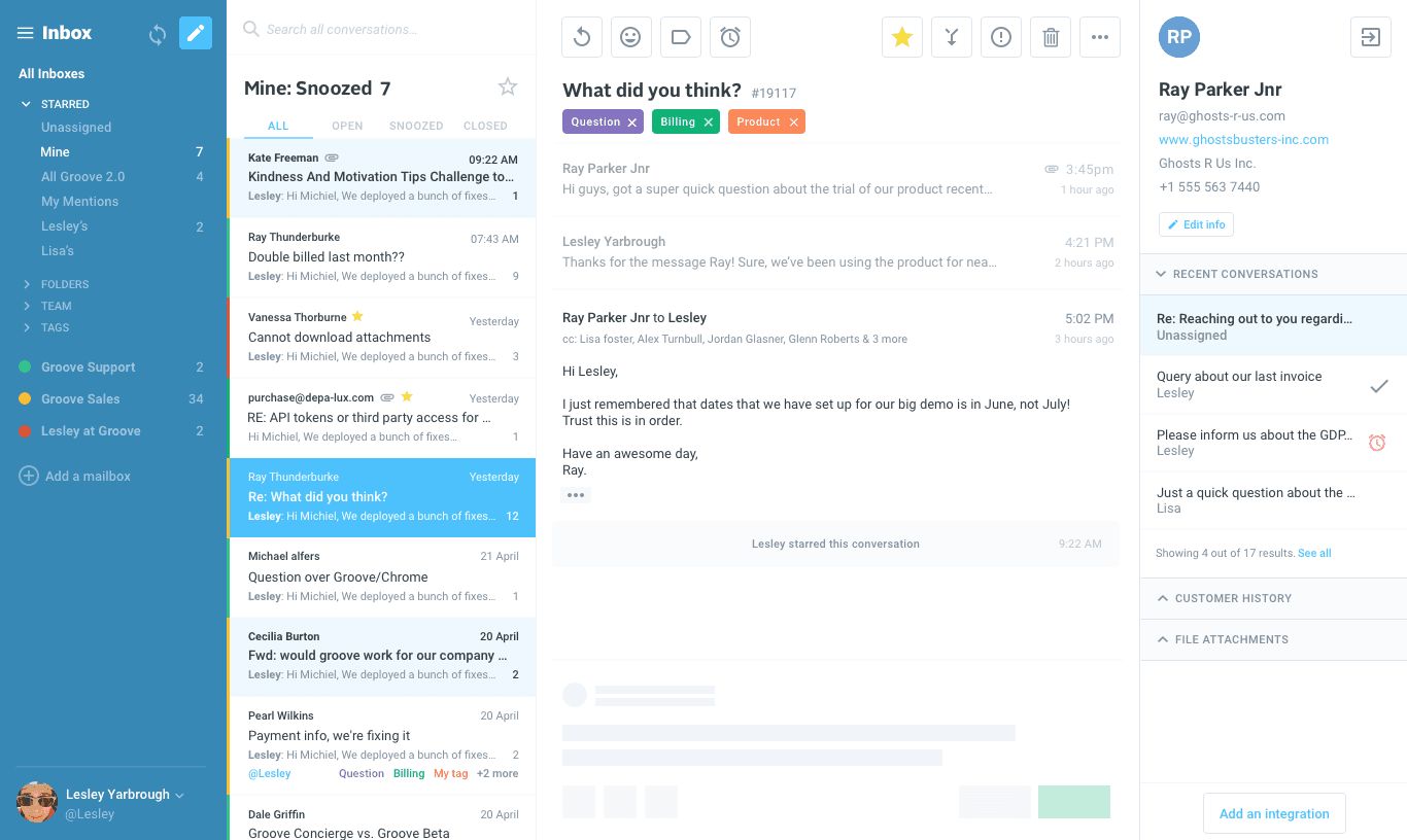
Slide Out Account Menu
We’ve removed the left navigation bar in the app and replaced with a slide out menu to navigate to the different Groove products. We found that people tend to not navigate between our different products as much as we thought, so we decided to maximise working space and make the navigation secondary.
You’ll also notice the new conversation button has moved to the top of the inbox list, where it makes much more sense.
Inbox Navigation
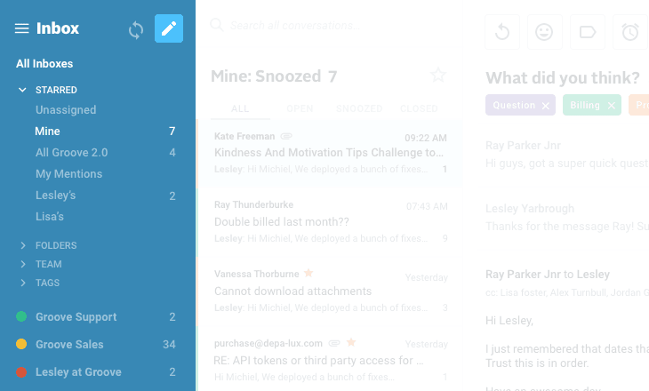
The top menu bar with your starred folders/searches is now gone in favor of a 4th pane on the left for navigating your inboxes, folders, teams, and tags.
This list is now persistent on the page, instead of being hidden behind a dropdown menu.
Your inboxes are color coded so you can easily see which inbox a ticket belongs to when you are browsing through a list.
Conversation List
Search has been moved to the top of the conversation list, making it a bit more accessible.
The list itself has been tweaked so the fonts, colors, and spacing make it easier to read so you can see the important details about the conversation at a glance.
As with the previous iteration, you can drag the right line of the list to widen or condense as needed.
Tags and assignees have also been cleaned up in the list, making them clearer and more visible within the list.
Conversation Page
With the conversation page, again our focus was on readability.
The fonts and spacing have been cleaned up. The action buttons at the top are organized based on how people actually use them. Tags are much more visible (and color coded!) at the top of the page. And collision detection has been overhauled so that it’s now impossible to miss when another agent is viewing, commenting, or responding to a conversation.
Right Sidebar
The right sidebar has also been given some love in the font and spacing departments, as well as a button to collapse and open it — giving you more space for your email contents & reply form if you need it.
Another nice addition is the collapsible sections to show/hide the details that you want.
What We Shipped in April
Refining the design was not the only thing we worked on in April. We may have slowed down our velocity on new features with the pending UI changes coming, but there are still a few noteworthy things we pushed out.
Mark as unread
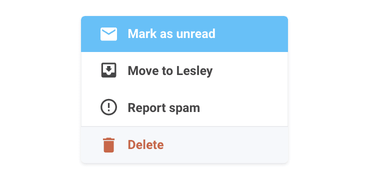
Whether you’ve intentionally or accidentally read someone else’s conversation, you can now “mark as unread” from the “more” action dropdown.
Live drafts begone
Previously when you started drafting a reply to a conversation the draft would appear in the conversation list as you were typing. Yes it was very distracting. Now a draft will not appear in the list until you have either closed the reply form or navigated to another conversation.
“G” shortcut to assign to yourself
When viewing a conversation, simply type “g” to assign the conversation to yourself.
Bug Fixes
- New conversations were broken when you tried to Send & Snooze
- Legacy phone conversations were not showing the first note in 2.0
- Searching for conversations in the merge modal wasn’t working
- Numbered folder shortcuts (0-9) were not working
- Random timeouts on search queries
Polish
- TO address on merged conversations now defaults to the contact who sent the last message
- Attachment thumbnails have been polished
- Unsnooze conversations by clicking the snooze time
- Closing a snoozed conversation unsnoozes and changes status to closed
- Replying to a snoozed conversation unsnoozes and changes status to what you’ve selected
- All snooze/unsnooze actions are shown in the conversation history instead of being aggregated
Coming Soon
List Sorting Options
We know this is one of the bigger features from the legacy app that is missing in 2.0 and we’re excited to say these options are coming back very soon.
Timestamps
More detailed timestamps for all messages and actions will also be coming back in the near future.
Change Customer
Soon you will have the option to change the customer on a conversation by editing the email address in the right sidebar.
Parsing 2.0
With the new parsing backend in place, we now have it working for major email clients like Outlook, Apple Mail, and Thunderbird. Next we are working on inline attachments, which has definitely been one of the more popular feature requests.
KB 2.0
We are on track to go into beta for the new Knowledge Base later this month. Stay tuned!
GDPR compliance
One of our top priorities before the deadline on May 25. Read more about our GDPR plan here.
Reports 2.0
We are making great progress on the new reports dashboard. The backend foundation is just about ready to rumble and soon we’ll be moving on the new interface.
Again, thank you so much to the customers who have taken the time to test out the new Groove inbox and give us feedback. We’ve been listening!