Google Data Studio Examples: These 5 Reports Save Me a Full Day of Work Every Month
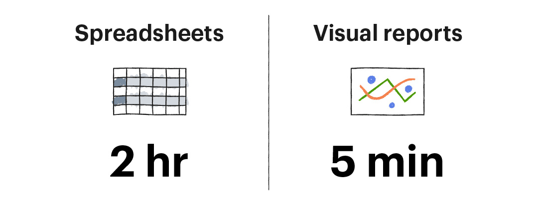
KPI reports used to take me 2 hours a week to prepare. Now I do it in 5 minutes. These Google Data Studio examples will show you how.
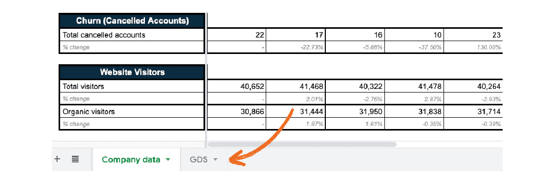
Not long ago, we had a manual, spreadsheet-based KPI reporting process.
Every week, I would review numerous tabs across a couple of Google Sheets files, compile the trends, and highlight anything important I found for our weekly review meeting.
It meant several hours staring at raw data that looked a lot like this:
Today, we’ve automated most of that process using reports we built in Google Data Studio.
Now, instead of staring at raw spreadsheet data, I flip through a few key reports that look like this:
It takes me about five minutes to review our marketing KPIs, and I’m able to track many more of them than I used to—because it’s so easy to see what’s happening now.
Even better—because Data Studio pulls directly from Google Sheets—there’s nothing manual about it—the numbers populate automatically every Monday. 🙂
In this post, we’ll show you how to do exactly what we’ve done above—transform raw data into visual reports that show you how you’re doing at a glance.
All without adding a ton of work to anyone’s task list.
5 report examples to get you started
Want to visualize your data the way we show in this article?
Don’t start from scratch!
For this article, we’ve created a sample data set and 5 Google Data Studio examples for ACME Software, a hypothetical SaaS company trying to hit $12 million in ARR by the end of the year.
The reports are formatted exactly the same as the ones we use internally here at Groove.
You can save a copy of the data set right here.
The curse of too much data
You likely collect a lot of data about your marketing and sales efforts. More than you can process most of the time.
The difficult part isn’t collecting data.
It’s converting that pile of numbers into actionable intelligence you can use to make business decisions.
Data is just data. The trick is finding insights in all those numbers.
How Google Data Studio works for us
One of our core values is “no waste,” which means we are always looking for ways to eliminate non-productive activities.
Staring at spreadsheets full of raw data is not an efficient use of anyone’s time.
For that reason, we started experimenting with Google Data Studio to see if we could turn the data in our company spreadsheets into visual charts.
Our goal was to reduce the number of hours it took to review our performance.
We wanted reports that would show us how we were doing—at a glance—without having to scan over numerous cells of raw data.
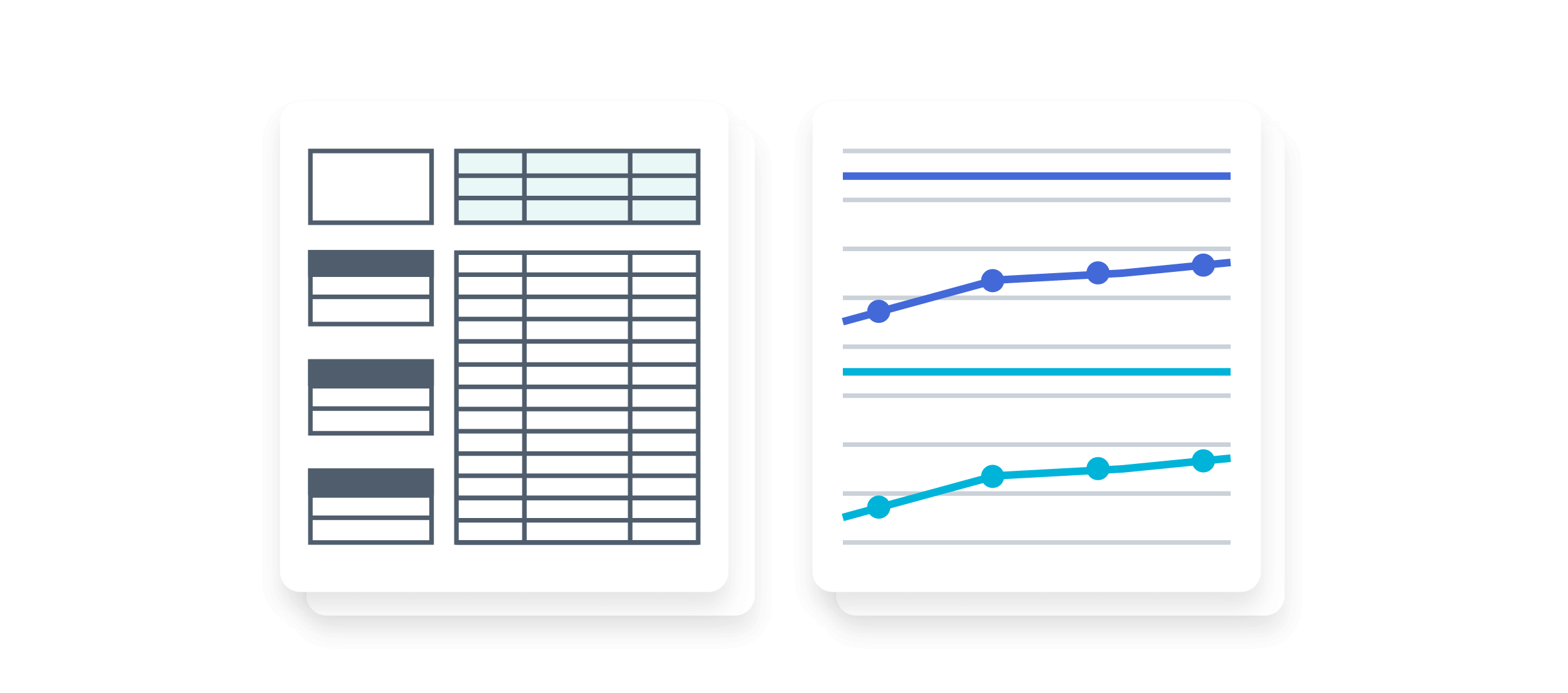
As a result, instead of staring at spreadsheets, we now have a simple set of reports that look like this:

My brain is so much happier looking at that vs. a spreadsheet. 🙂
It’s not fancy, but it shows me a huge amount of important information:
- Where we stand on two KPIs
- The target we’re trying to reach by the end of the year
- The trend over the last quarter
It would take me several minutes to gather all the same data and trends for just those two numbers.
The best part about these GDS reports? They’re automated.
I update them once a quarter, which takes me a couple of hours. After that, they populate automatically as we gather data in our tracking spreadsheets.
9 KPIs we review every month
I won’t show you every metric we track internally here at Groove—we have a few dozen we look at at least once a month.
But I’ll show you Google Data Studio examples of some of the ones that are most important to us.
- Annual recurring revenue (ARR)
- Monthly recurring revenue (MRR)
- New trial signups
- Blog-assisted trial signups
- New paid accounts
- Account cancellations
- Total website traffic
- Organic website traffic
- Trial to paid conversion rate
The process is what matters here, not the individual metrics. Substitute your KPIs for the ones we show in the Google Data Studio examples below.
As you’ll see, GDS lets us quickly review performance data for any KPI we’re tracking—including how close we are to meeting our targets.
Once it’s set up, reviewing dozens of metrics and trends only takes a few minutes.
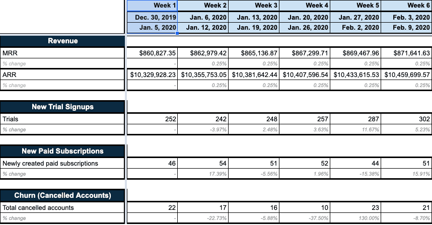
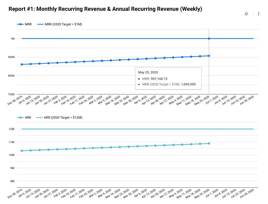
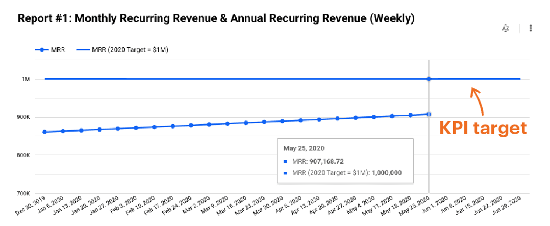
Example #1: MRR and ARR
Monthly recurring revenue (MRR) is the heartbeat of any SaaS business, and Groove is no exception. In a non-SaaS business, this will probably be monthly revenue rather than MRR.
Either way, it’s the number that lets you plan everything else—from ad spend to payroll. If you’re a CEO or a founder, this is probably the number you track the most.
Annual recurring revenue (ARR) is just as important as the monthly number. It’s less about budgeting and more about the long-term growth prospects of your business.
If you have investors or key stakeholders, this is the report they’ll want to see.
Example #2: New trial signups
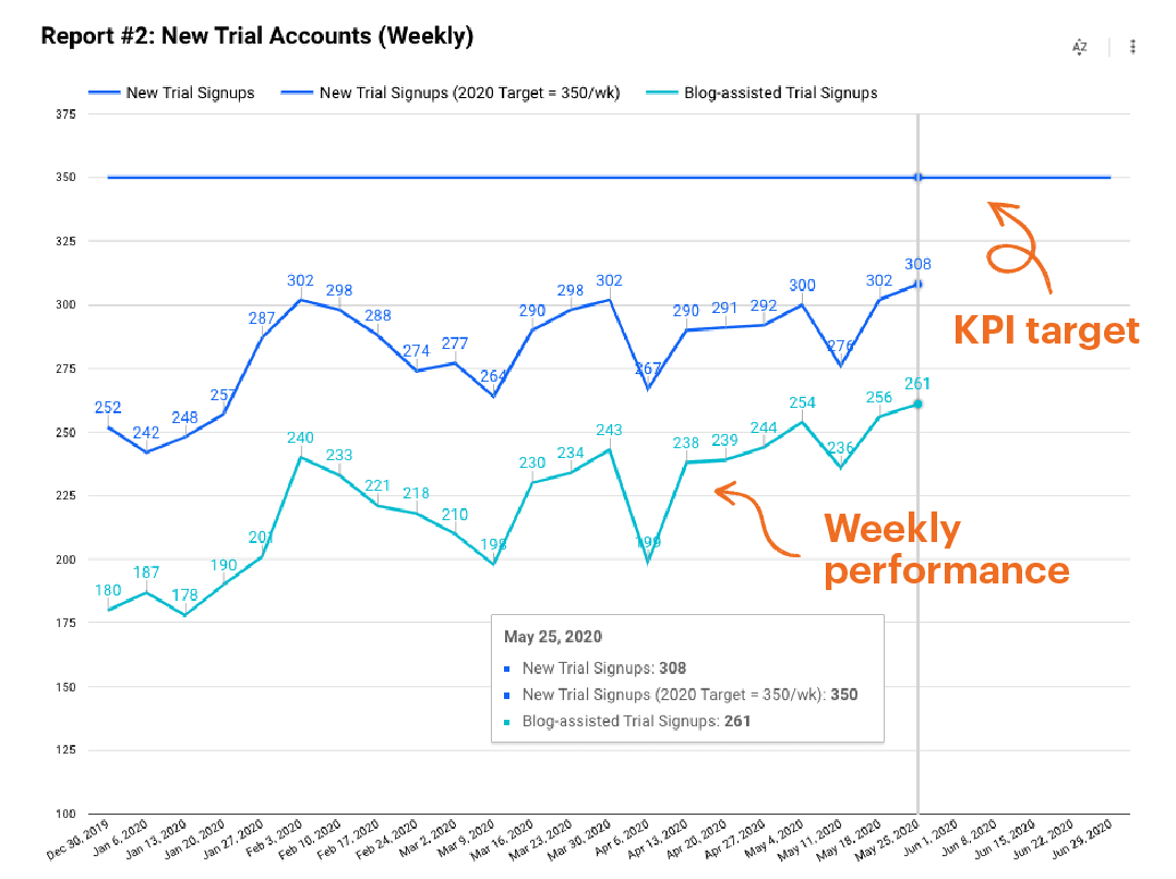
Like MRR and ARR, new trial signups are a key indicator of the health of a SaaS. In this report, we track that number along with a metric we call blog-assisted trial signups.
“Blog-assisted” means someone visited the blog at some time during their research phase—before signing up for a trial account. We track it as a KPI because content marketing is such a strong acquisition channel for us.
Together, these two KPIs tell us if we’re:
- Attracting the right people to our website
- Converting them into trial users or customers.
Example #3: New paid customers and account cancellations
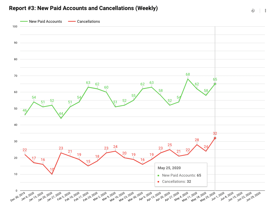
This report is my personal favorite of all the ones we review on a regular basis. I love it because:
If the green line is consistently above the red line, we win.
Instead of tracking revenue, it tracks:
- Green line = New paid customers
- Red line = Paid customers who cancelled
In general, from a business perspective, if the green line is consistently above the red line, it means MRR and ARR are trending up.
This chart does not correlate exactly with ARR and MRR changes—because accounts vary in size. If we add a big account with dozens of users, it will be a bigger lift than the trend shows in this chart.
Over time, however, those variations average out.
The net effect is a report that acts as an “at a glance” indicator of whether our marketing efforts are helping us grow.
Example #4: Website traffic
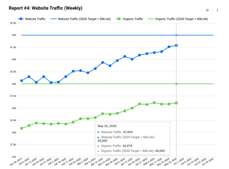
We’ve written many times about how content marketing is the primary way people find Groove. For that reason, slow, steady, consistent growth in the traffic to our website is a key indicator of the success of our efforts.
We track both total traffic and organic traffic—with organic being the more important of the two since it tends to be more consistent and predictable.
For our content team, organic traffic is the metric we track most closely.
Our formula for growing organic isn’t a big secret, by the way. It’s the same approach you’ve heard many times before:
- Make your website fast and easy to navigate
- Publish high-quality content on a regular basis
- Promote your content in a way that attracts backlinks
The difficult part isn’t understanding what to do—it’s executing at a high level over time.
Example #5: Trial to paid conversion rate
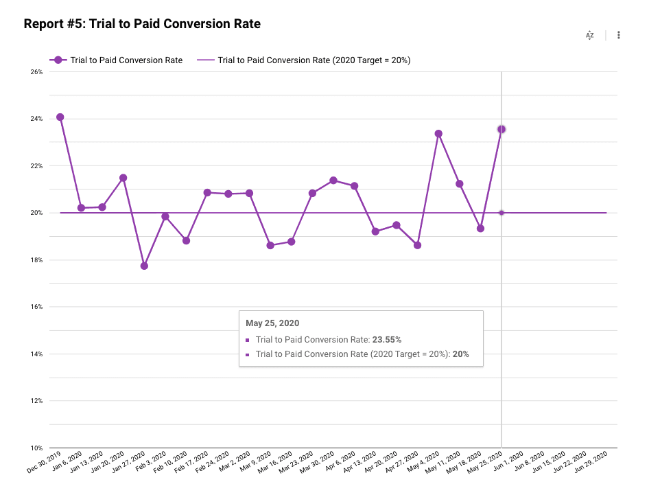
Finally, once people sign up for a trial, we want to see how many convert to paying customers.
This stat is always a little volatile—a reflection of the relatively small numbers (compared to something like ARR, for example).
Benchmark stats vary widely by industry and product type, but for SaaS products like ours, a 15% to 20% conversion rate is usually the range considered as “good.”
As long as it’s bouncing around the 20% number, we’re happy.
We watch this number primarily to monitor the funnel.
If we see a big drop-off in conversion rate, it’s probably a signal that something in our automation is broken and needs to be addressed immediately.
How to create Google Data Studio reports
Fair warning that this part is a little technical.
But it’s so worth spending some time learning these setups.
A few hours learning GDS reports has saved us countless hours in the long run.
Disclaimer also Google will no doubt change GDS features over time. If something looks different than what you see here, check Google’s support site for the most recent information.
If you’ve never used Google Data Studio before, my best advice is to use our numbers to get used to GDS by following the steps below.
Then you can move on to building reports for your own business.
Working with Google Sheets
Google Data Studio can connect to a variety of data sources—including Google Analytics. You can also upload data you have in Excel using CSV format.
The Google Data Studio support site has full instructions for connecting data from other sources.
For our examples here, however, I’ll show you we use Google Sheets as the data source.
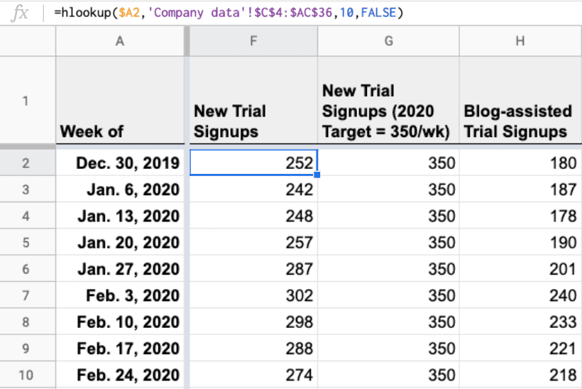
Step #1: Create a “GDS” tab in your spreadsheet
This step was the biggest “ah-ha” moment I had as I was trying to figure out how to make GDS work for us.
At first, I tried to directly connect the main tabs in our spreadsheets as sources for Data Studio reports.
That was… a nightmare.
Nothing formatted correctly. Different tabs had different structures. It was a mess. And I couldn’t do anything to the main spreadsheets for fear that I would delete or alter the data on accident.
So, instead of pulling data directly from the tabs I normally reviewed, I created a special tab just for GDS data.
In my reports, I call this tab “GDS.”
This step has two major advantages:
- You make 100% sure not to accidentally delete or alter the raw data from your main tabs
- You create a place you can format and organize data so it’s much easier to pull into GDS
Step 2: Use formulas to pull KPI’s into the GDS tab
Don’t just copy and paste data into the GDS tab.
Instead, use formulas that dynamically pull data from the other tabs in your spreadsheet.
In our sheets (and in the sample data set), we use an HLOOKUP function to pull data from the main tab.
=hlookup($A2,'Company data'!$C$4:$AP$36,10,FALSE)
This is the step that converts your sheet from a static report into an automated dynamic report.
By using formulas, your GDS tab will automatically populate with new data as it’s entered into your main spreadsheet tabs. You won’t have to touch the GDS tab again unless you run out of dates.
Pro tip: Add your performance targets in the GDS tab
This is easily my favorite hack in this whole process.
Every time we do quarterly planning, we set goals we’d love to achieve for each KPI.
I put those goals into the GDS chart as a unique column with the target number in every cell for the quarter.
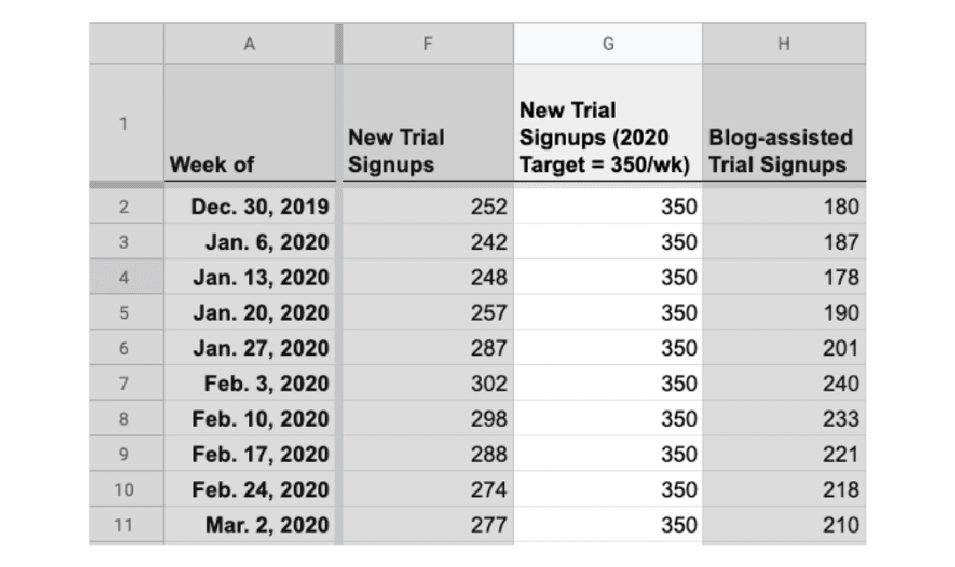
Later, when I pull that column into a Google Data Studio report, it will come through as a single line on my graph representing our KPI target for the quarter:
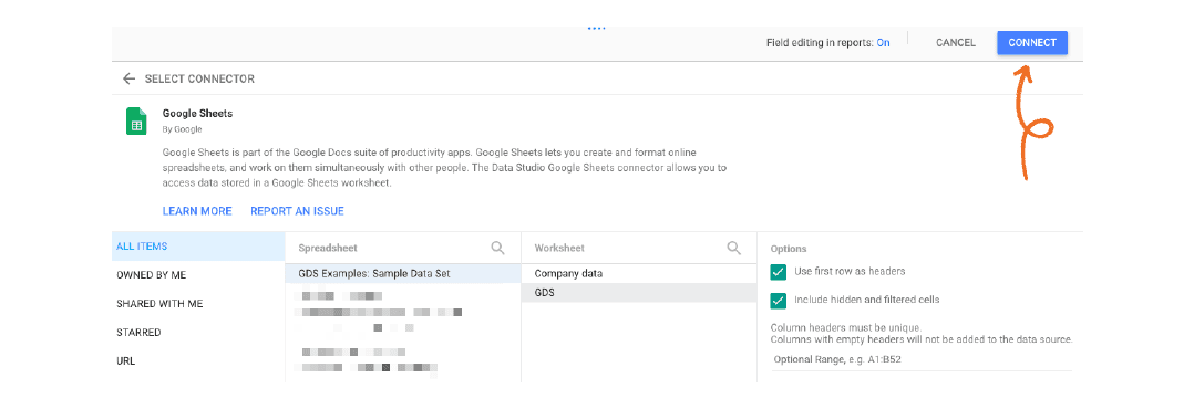
Step 3: Connect the GDS tab to a Google Data Studio report
Open Google Data Studio and create a “Blank Report”:
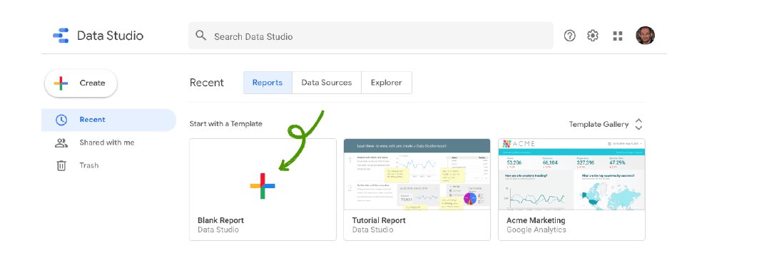
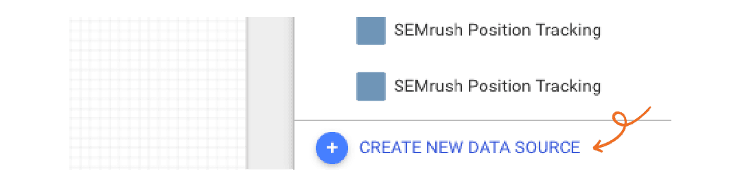
GDS will open a new report with a blank grid on it. At the very bottom right, click “Create a New Data Source”:
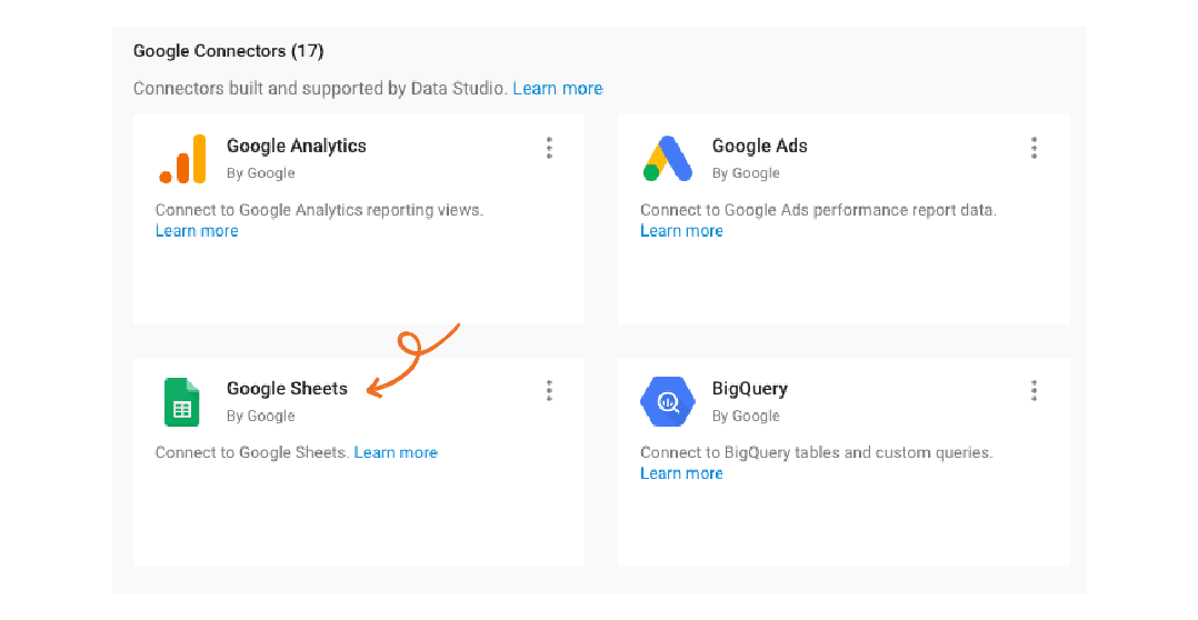
Under Google Connections, choose “Google Sheets”:
Then select your spreadsheet and the GDS tab:
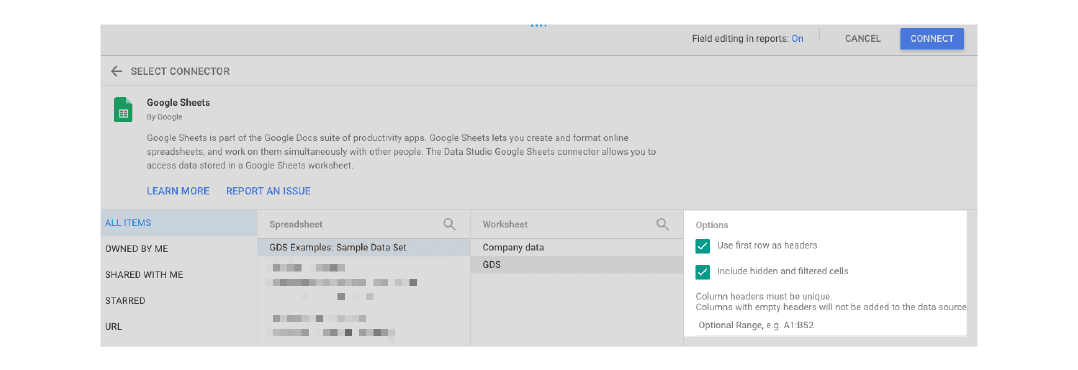
Leave the two checkboxes on the right checked.
In the upper right, click “Connect” to make the connection.
Step 4: Configure your data fields
This next step is very important.
You’ll see a screen that looks like this:
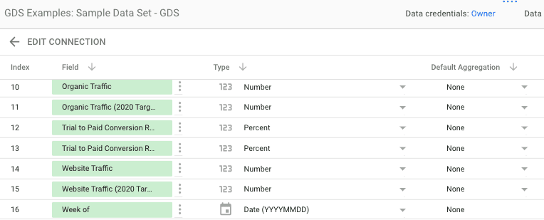
- Under “Type,” set all numbers to “Number”
- Set all percentages to “Percentage”
- Set all dates to the date format you’re using in the GDS tab (Ex: “Date YYYMMDD”)
- In the third column, change the Default Attribution to “None” for every row
When you’re done, click “Add to Report” in the upper right to finish the setup.
The final task: Creating a visual report
Phew.
If you’re still with me, congratulations. I know the above steps weren’t easy.
But… you just made it very easy to create visual reports from your KPIs for weeks and months to come.
The remaining steps are very straightforward.
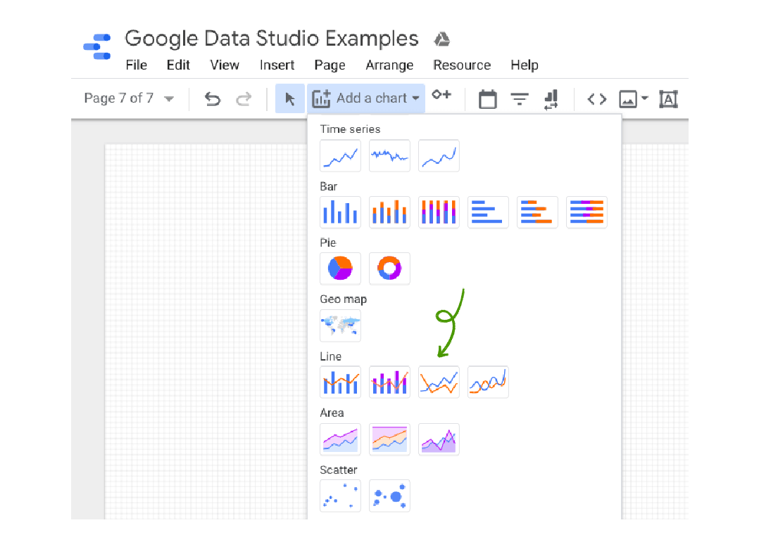
Step 1: Create a ‘Line’ chart
At this point, you’ll be staring at a blank grid in Google Data Studio.
In the menu, select “Add a chart,” then choose a “line” report, then draw a box on the grid to create the chart:
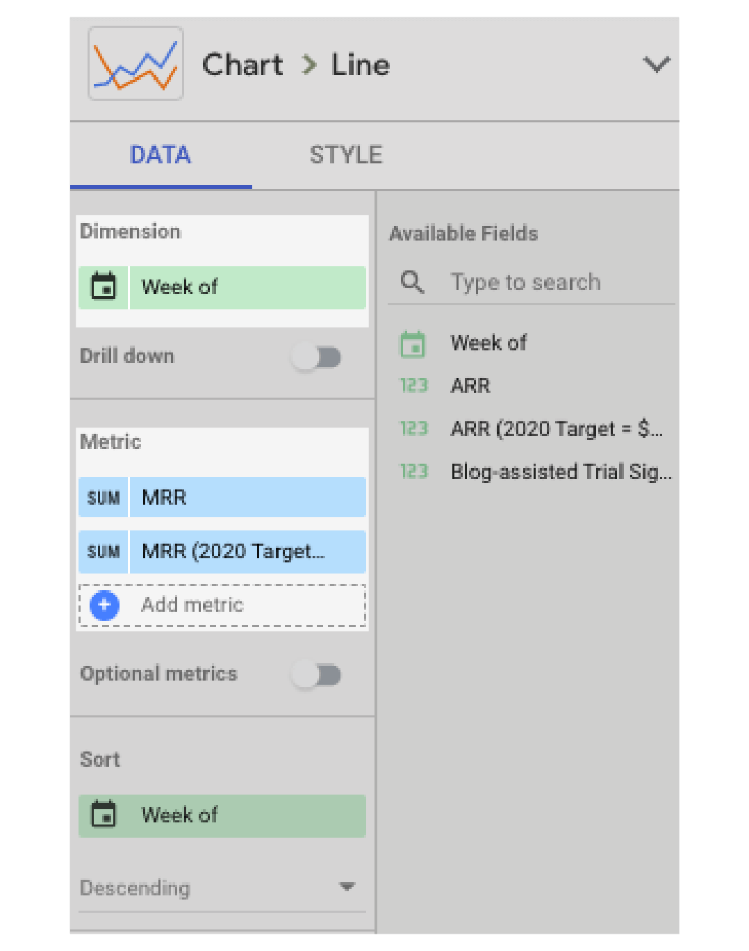
Step 2: Choose your KPI from the data menu
In the data menu, make sure “Dimension” is set to data range.
Then add your KPI to this chart under “Metric.” You can add multiple KPIs to one report this way:
Step 3: Use style options to make your chart as easy to understand as possible
Finally, use the “Style” tab to alter the way the data looks in your chart.
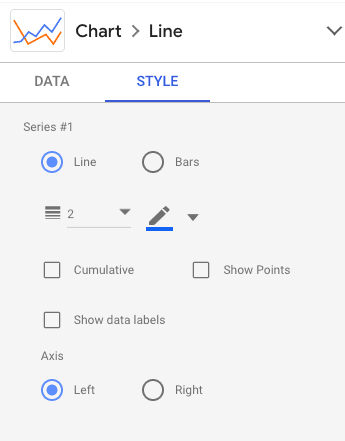
You have a variety of formatting options. The ones I use the most are:
- Changing the color and weight of each line
- Reversing the X or Y axis (if your data is showing up in reverse order)
- Altering the minimum and maximum values
- Adding data labels
I find I choose different options for each report I build. For example, I often change the default minimum and maximum to move the numbers up or down my chart.
You just have to play with the controls for a while to get the options right.
Troubleshooting: Fixing common GDS problems
Here’s something that happens again and again when I’m working with Google Data Studio:
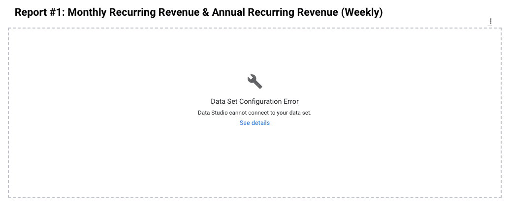
I’ll make a change to the “GDS” tab, which then breaks the connection to the charts I’ve created in GDS. When it happens to you (and it will), you’ll get a screen just like the one above.
When it happens, go to your data set and click the little pencil next to your data source:
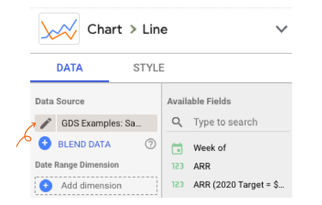
Then refresh the connection:
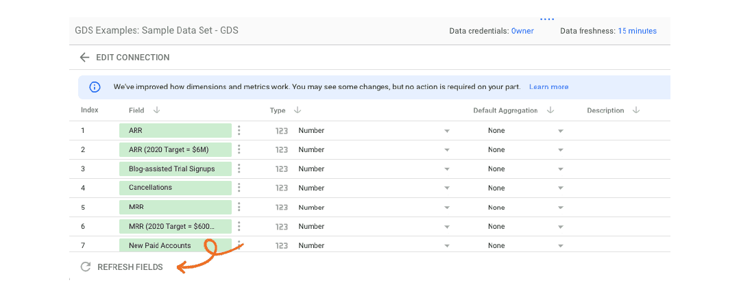
This will reconnect the GDS tab in your spreadsheet and update the data feed with any changes you’ve made.
Important: Make sure you check the “Type” and “Default Aggregation” fields again after refreshing the fields.
Two problems to look out for:
- In the “Type” column, percentages have a habit of reverting to numbers.
- In the “Default Aggregation” column, new or altered fields will often show “Sum” again. Change them back to “None” as you did in your original setup.
How do we get all these metrics into Google Sheets in the first place?
For the record: Spreadsheets are not the enemy. They are necessary to create the database we use to guide our business decisions.
How do we find the time to keep track of this many data points—even though we’re a small team?
Answer: Automation.
Much of our data is populated automatically using a variety of integrations and tools.
We’re fans of Supermetrics, in particular, and recommend it to anyone who wants to see what’s really happening with your data—without spending hours a week manually entering numbers into spreadsheets.
Many of our other connections were created by our internal development team. You can also do a lot with tools like Zapier and IFTTT, which we also recommend.
Whatever the tool or the process, if you can spend an hour today to save hours of work in the future, do it.
The payoff: No more staring at spreadsheets!
Congrats! You just transformed that headache-inducing spreadsheet data into an easy-to-read Google Data Studio report.
Now you can check your numbers at a glance, without staring at a spreadsheet full of numbers trying to make sense of them.
I know for myself, I check our numbers far more often after setting up this process here at Groove.
GDS makes it easy. It tells me what I need to know at a glance—all using a tool I can access for free.
When it comes to data, what could be better than that?