3 Early Fails That Nearly Killed Our Startup
Last week we detailed what went right in Groove’s early days. Now let’s take a look at what went wrong…
This is part four in our ongoing series, A SaaS Startup’s Journey to $100K a Month. Our earlier posts can be found here.
If you’re part of an early-stage startup, you know how fragile a young business can be. Without sustainable revenue or an established brand to fall back on, it doesn’t take a whole lot to crash and burn.
In Groove’s early days, we nearly crashed and burned not once, but three times. What follows is exactly what happened, and what you can learn to avoid making the same mistakes.
The Temptation Of Selling Out
Soon after our beta launch and the explosion of attention from our TNW coverage (detailed in last week’s post), I received two early acquisition offers that would’ve been a hell of a paycheck for the six months of work our team did.

Overnight, the way that I looked at Groove changed.
The siren song of an early exit can be damn powerful, and instead of thinking about the future of Groove, I began to think about how to optimize an acquisition payout.
I cut back on costs, and product development more or less stalled while I took meeting after meeting, working out the terms that would make us all rich.
This lasted for months. As I walked away from the 10th meeting in the long, drawn-out process, I couldn’t help but think I was doing something wrong.
I started thinking about the reason that I founded Groove in the first place. After my first acquisition, I promised myself that my next business would create a long-term, sustainable lifestyle. I wanted to build a company that provided my team and me the means to do everything that we love — both in and out of the office. Burning out and selling every three years isn’t the way to do that. Once I realized that, I knew I had to end our acquisition talks.
But as I took stock of where we were, I came to the painful realization that this distraction had cost us dearly. I wasted almost a year entertaining these offers, distracting the team from product development and crippling our productivity. We also missed some important opportunities; we were chosen for the Under The Radar conference, and didn’t even attend because of the acquisition talks — I didn’t think it was necessary.
So a year behind on development, and no longer looking for a way out, we re-committed ourselves to building a sustainable, growing business.
Disclaimer: I know that acquisition offers aren’t a “problem” that most early-stage startups deal with. Hell, most founders would love to have my problems, and I fully admit that I really, truly have nothing to complain about. But the issue here isn’t acquisition offers; it’s back-office distractions. For many startups, that means deciding on whether or not to bring on a co-founder, hiring decisions and going back on forth on figuring out what payroll and accounting software to use. No matter how big or small, these are distractions that keep you from your number one priority, which should be building your business.
** What I learned: Focus is absolutely essential**. No business can afford to be stagnant for months while the founder waffles on his dreams. The grind will wear you down and cloud your judgment. Know what you got into this game for, and try to never forget it.
Creating a Monster (Product)
We had a wishlist of features that we thought would add value to our product. The only problem is, that “wishlist” turned into a “must have” list, and it grew each time we thought of something we liked. Just like the acquisition setback, we lost sight of what we had set out to do: build a simple, elegant solution that wasn’t like the existing, cumbersome products. Nonetheless, slowly but surely we added feature after feature, pushing our launch date back with each one.
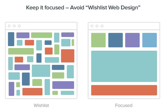
I made the mistake of thinking that more features would result in more value, which flew directly in the face of the product I set out to build: a simple alternative to the incumbents. Unfortunately, when you’re staring down the end of your runway and facing the reality that you need to find some customers or your company will die, logic has the tendency to fly out the window. I was sure that the more we offered, the more users we could be helpful to. Unfortunately, the opposite turned out to be true.
We were trying to figure out why beta users were abandoning our product so quickly after signing up, when it hit me like a ton of bricks. Except instead of bricks, it was a ton of features.
As an example, here’s what our onboarding process looked like:
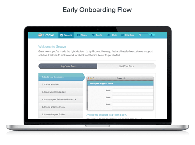
Who, in reality, could possibly want to go through a process like that, just to get the value they had just been promised was only a few clicks away? The “Need Help?” in the bottom right corner is almost funny to me now. Anyone would need help trying to navigate that monster. And that monster existed because we had added so many features, and tried to push every single one of them on our users.
We were approaching the end of our runway. Not only that, but our product was becoming what we hated most: a big bag of bloat. Sure, we had lots of features, gamification, ancillary apps and more, but we also didn’t have a single paying customer.
We would soon strip down the product (more on that later) and finally begin to get our users engaged. The only thing standing in our way? Getting more people to actually sign up…
** What I learned: Focus on the single thing you do best**, and be the best in the marketplace for your customers — not for everyone else. Trying to be everything to everyone is the easiest way to become right for no one, and we were headed in that direction.
The Terrible, Horrible, Inexcusable $50,000 Mistake That No Startup Should Ever Make
Your marketing site is supposed to tell the story of your product, right?
Well, as I painfully learned, not exactly. Your marketing site is supposed to tell the story of your targets’ pain points, to show them the solution, and to convert them into users.
Nonetheless, when we started out, I assumed that we needed to tell our story.
The whole story.
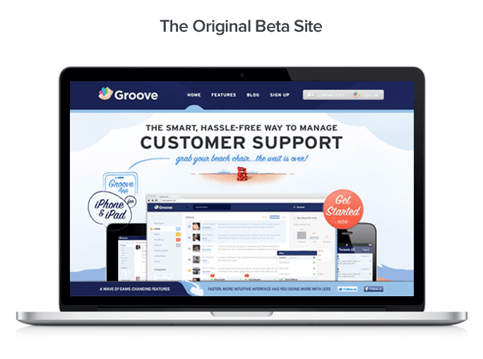
Now, while we were in private beta, we had a very simple site that actually worked really well at converting visitors to beta subscribers.
Not terrible, right?
But as I was getting ready to launch Groove to the public, a paralyzing fear started to take hold: even if our product was awesome, how could anyone take us seriously when our site looks so spartan compared to the competition?
Zendesk, Desk.com and UserVoice all had (and still have) big, robust marketing sites. If people looked at Groove’s simple little landing page, they’d think we must be some kind of chumps. Right?
This is where everything starts going wrong.
First, we had to do some research.
But not just any research. We couldn’t risk being underprepared, so our research included a 42-page competitive canvas, a number of messaging and positioning exercises, and a comprehensive market gap analysis that I now wonder how we ever made sense of.
That research took us weeks to complete, and during that time, we didn’t mock up a single design.
But, armed with massive amounts of research to back up our strategy, we were ready to get started. We set out to build the best damn marketing site, period. Except that we thought best meant most impressive.
Everyone else had long-scroll landing pages with carousels and dynamic images. So we would, too.
Here are a couple of our earliest sketches.
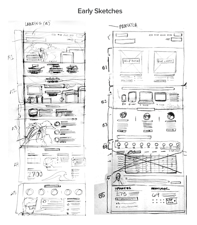
Happy that our design plan covered the scope of everything a marketing site would ever need to have, I gave the go-ahead to push forward.
Of course, the bigger a site is, the longer it takes to build. And as our site grew and grew, the fact that we didn’t have a single paying customer yet didn’t matter; the payroll checks still had to be cut. I was burning through our runway as if we had revenue, and the idea of spending a week getting our icon sets right didn’t even phase me. It had to be perfect.
Hindsight is 20/20. Hindsight can also be incredibly painful. The decisions I was making could not have been dumber.
We built page after page and section after section, forging on without testing any of them on a single user.
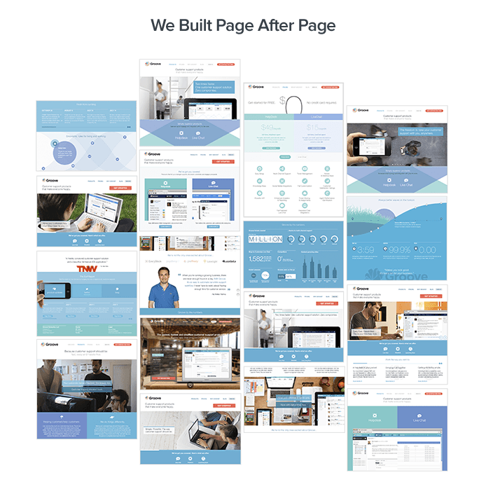
Still, as wrong as my vision was, five months after we started, my vision became reality. Here’s what that the final site looked like:
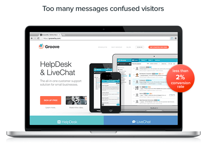
It sure was pretty to look at. So we flipped the switch, and the site went live.
The traffic came, and after the first 2 weeks, I looked at our analytics.
You know that feeling in your gut when you begin to think that you may have made a huge mistake? Yeah.
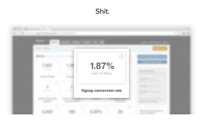
Our conversion rate was less than 2%.
Nobody was even scrolling past the fold. The site was overwhelming our visitors, and the navigation we were asking of them was simply too much work.
But it wasn’t just the design. We also suffered on the positioning end: because we had two features that we thought were equally valuable, we made the painful error of thinking that we could position ourselves as a “product company” offering a suite of support products, rather than simply a customer support company. Our messaging was scattered and our visitors were confused; nobody was sure what we actually did.
Realizing that if our conversion rate continued to suck this badly, we’d soon have to fold, I had a difficult decision to make. But looking at our metrics and visitor behavior, the only way out of this mess would be to abandon five months of painstaking (and painfully expensive) work.
So we swallowed our pride and put up a three-page (landing, pricing and signup) site that was hyper-focused on the benefits of our helpdesk platform, and nothing else. No live chat. No ancillary features. The site took three days to build.
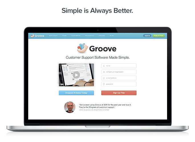
Conversions tripled overnight.
Perhaps the most painful part of this lesson is how closely the new, effective site resembles our original beta site. If we had simply made tweaks to that one, added pricing and launched it to the public, I suspect we would be in a completely different place today.
Since the turnaround, we’ve gone through many iterations to optimize conversions, but each one was tested early and often. No comprehensive research exercises. Just build it, ship it, test it, and iterate.
Ultimately, our mistake wasn’t that we were building the wrong marketing site. The mistake was being so damn sure our initial assumptions were right, that we thought we had to do whatever it took to deliver on those assumptions. What it took was $50,000 and five months of work.
Wasting $50,000 hurts any business. Wasting $50,000 only to ultimately cripple your business? That cuts a lot deeper.
** What I learned: Swallow your pride, and test your assumptions vigorously.** Your customers don’t care about your grand plans for the business, they care about you solving their problems and providing more value than you charge for. That’s it. Distill your messaging so that it’s incredibly clear what value you’re providing. Whatever you think you know, there’s a great chance that you’re wrong, so test fast before betting the house on a single strategy. And please, please, please don’t spend as much time as we did on market research.
Stripping Down and Turning a Corner
We exited beta testing and launched to the public in November of 2012, raising a $1M convertible note from a group of angel investors — our terms were much more favorable and less restrictive than the ones we explored with VC’s, and the level of trust that I had in our investors was much higher from the start. Simply put, they have more skin in the game.
Though we weren’t quite ready for the onslaught of signups, TNW covered the launch. And while we hadn’t yet found product/market fit, we were obsessive about tracking user behavior and feedback, so we were able to learn a lot from the new wave of traffic.
Over the next few months, the feedback we were getting was clear: while the design was awesome, the product was more than users needed, and it was getting more complicated each time we “enhanced” it.
We had disproved our initial hypothesis about the features we thought users wanted, and learned what our users actually wanted: simple ticketing and knowledge base software. So armed with that data, we stripped down the product to its core, moved our ancillary features into the App Store, and simplified the user experience.
That simplification was a major turning point for us.
What’s Next?
The past eleven months since our public launch have been a whirlwind, and I’ve got the eye wrinkles to prove it. But we’ve learned an incredible amount in a short time.
Next week, I’ll be sharing how we turned a $0/month company into a $30K/month company. I’ll detail the strategies that we used, and the ones that we plan to use moving forward on our road to $100K and beyond.
We’ll cover:
- The specific blogs that I study every week to be a better entrepreneur
- The single Tweet that brought us 100 new trial signups
- The stupid-simple A/B test we ran that boosted conversions nearly 300%
We’ll be releasing a new post each week. To get each post emailed to you as soon as it’s published, sign up for the $100K mailing list below.
See you next week.